Last updated at February 2, 2026 by Teachoo
Transcript
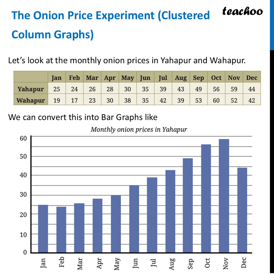
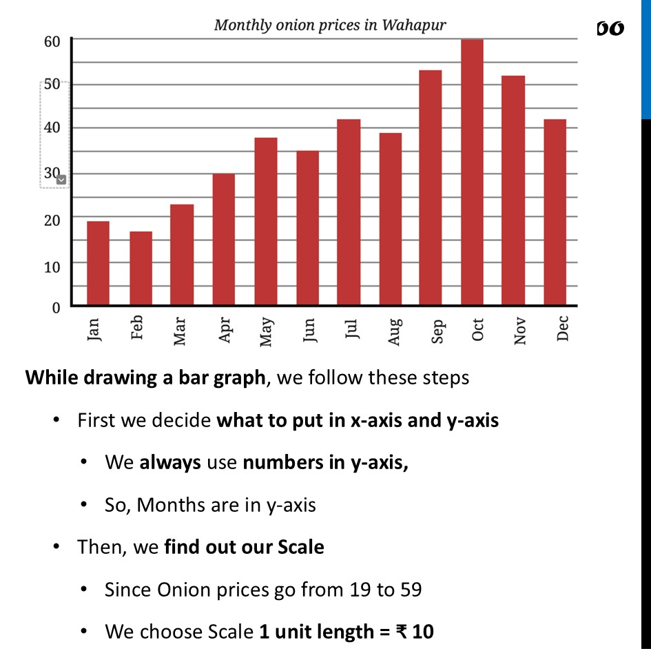
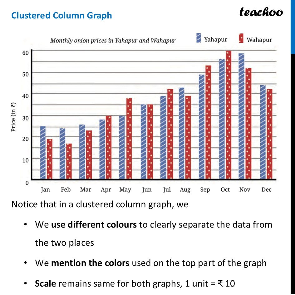
The Onion Price Experiment (Clustered Column Graphs)Let’s look at the monthly onion prices in Yahapur and Wahapur. We can convert this into Bar Graphs like While drawing a bar graph, we follow these steps First we decide what to put in x-axis and y-axis We always use numbers in y-axis, So, Months are in y-axis Then, we find out our Scale Since Onion prices go from 19 to 59 We choose Scale 1 unit length = ₹ 10 But, how do we compare the prices for both like this? If you look at the table, you have to read every number to compare them. If you look at the separate graphs, your eyes have to jump back and forth between the two pictures. The solution: We can combine both graphs Clustered Column Graph Notice that in a clustered column graph, we We use different colours to clearly separate the data from the two places We mention the colors used on the top part of the graph Scale remains same for both graphs, 1 unit = ₹ 10 Note: The dots and slanted lines within the bars help people who find difficulty in distinguishing colours. It is also useful when things are printed in greyscale (black-and-white).