![Comparing the Data (using Dot plot & Table) [Class 7 Part 2] - Teachoo - Dot Plot](https://cdn.teachoo.com/5ec7e37a-26d4-4cdc-a8d1-5027cc450771/slide44.jpg)
Last updated at January 30, 2026 by Teachoo
Transcript
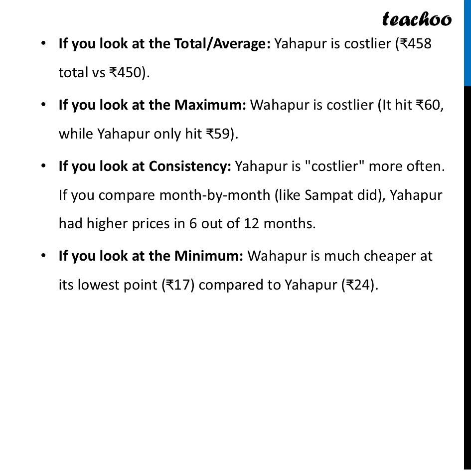
Comparing the Data (using Dot plot & Table)Let’s say we have to answer Which town is "costlier"? There isn't just one "right" answer here; it depends on how you look at the data! Like: If you look at the Total/Average: Yahapur is costlier (₹458 total vs ₹450). If you look at the Maximum: Wahapur is costlier (It hit ₹60, while Yahapur only hit ₹59). If you look at Consistency: Yahapur is "costlier" more often. If you compare month-by-month (like Sampat did), Yahapur had higher prices in 6 out of 12 months. If you look at the Minimum: Wahapur is much cheaper at its lowest point (₹17) compared to Yahapur (₹24).