![Dot Plot - Meaning, With Examples - [Class 7 Part 2 Ganita Prakash] - Dot Plot](https://cdn.teachoo.com/41a86c9c-155f-40d1-8403-97b2f990c76d/slide42.jpg)
Last updated at January 30, 2026 by Teachoo
Transcript
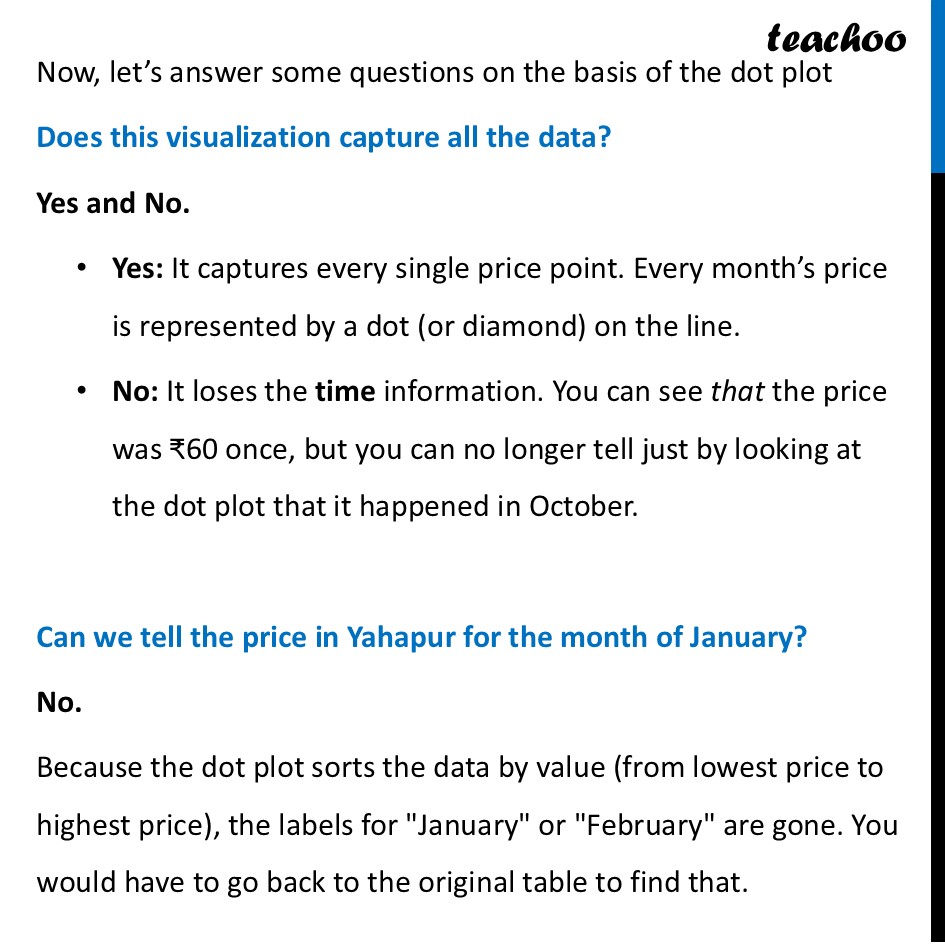
Dot PlotThe dot plot is a visual way to see the "spread" of the data. Instead of just looking at a list of numbers, you see where the prices "clump" together, and find maximum & minimum values Example: Dot plot for Prices for Onions in Yahapur and Wahapur Now, let’s answer some questions on the basis of the dot plot Does this visualization capture all the data? Yes and No. Yes: It captures every single price point. Every month’s price is represented by a dot (or diamond) on the line. No: It loses the time information. You can see that the price was ₹60 once, but you can no longer tell just by looking at the dot plot that it happened in October. Can we tell the price in Yahapur for the month of January? No. Because the dot plot sorts the data by value (from lowest price to highest price), the labels for "January" or "February" are gone. You would have to go back to the original table to find that.